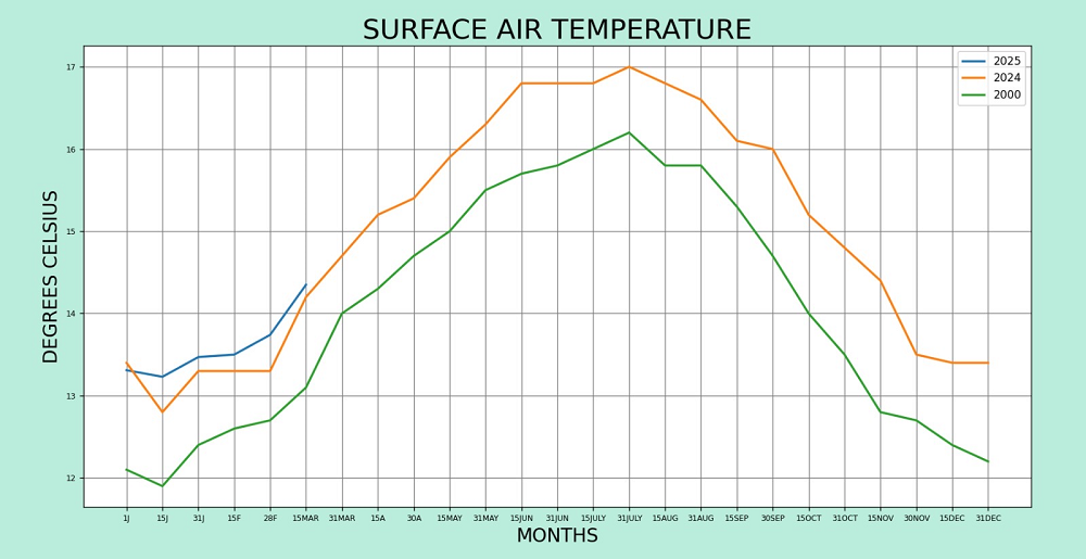
The graph shows the average global temperatures recorded in the years 2000, 2023, and 2024.
On the x-axis, there are the first days and the 15th day of each month.
It was created using Python source code with data extracted from the "Climate Reanalyzer"
website of the University of Maine at

The Python source code was written by Paolo P. and edited with CSS by Alecxandra Denisa B.
third year students at a scientific high school.
The Python code is described below:

  1. import matplotlib.pyplot as plt
  2. plt.rcParams.update({"font.size": 7})
  3. plt.figure("AVERAGE TEMPERATURES", [10,10] facecolor="#BBDEDE")
  4. mesi = ["1J", "15J", "31J", "15F", "28F", "15MAR", "31MAR", "15A", "30A", "15MAY", "31MAY", "15JUN", "31JUN", "15JULY", "31JULY", "15AUG", "31AUG", "15SEP", "30SEP"]
  5. mesi2 = ["1J", "15J", "31J", "15F", "28F", "15MAR", "31MAR", "15A", "30A", "15MAY", "31MAY", "15JUN", "31JUN", "15JULY", "31JULY", "15AUG", "31AUG", "15SEP", "30SEP", "15OCT", "31OCT", "15NOV", "30NOV", "15DEC", "31DEC"]
  6. plt.plot(mesi, [13.4, 12.8, 13.3, 13.3, 13.3, 14.2, 14.7, 15.2, 15.4, 15.9, 16.3, 16.8, 16.8, 16.8, 17, 16.8, 16.6, 16.1, 16], label="2024", linewidth=2)
  7. plt.plot(mesi2, [13, 13, 13.5, 13.5, 13.5, 14.3, 14.2, 14.7, 15.2, 15.7, 16.2, 16.5, 16.6, 16.9, 17, 16.8, 16.5, 15.9, 15.3, 14.5, 14.5, 13.9, 13.3, 13.4, 13.3], label="2023", linewidth=2)
  8. plt.plot(mesi2, [12.1, 11.9, 12.4, 12.6, 12.7, 13.1, 14, 14.3, 14.7, 15, 15.5, 15.7, 15.8, 16, 16.2, 15.8, 15.8, 15.3, 14.7, 14, 13.5, 12.8, 12.7, 12.4, 12.2], label="2000", linewidth=2)
  9. plt.title("SURFACE AIR TEMPERATURE", fontsize=25)
  10. plt.xlabel("MONTHS", fontsize=17)
  11. plt.ylabel("DEGREES", fontsize=17)
  12. plt.grid(color="grey")
  13. plt.legend(fontsize=10)
  14. plt.show()